Hard Rock Cafe Email Redesign
UI / UX - Wireframes - Prototypes - HTML & CSS
Summary:
Inconsistent employment and lack of creative direction led the Hard Rock Cafe team to deploy Email Campaigns that were off-brand and behind on industry standards. With Contact Lists in the hundreds of thousands, this was one of the first projects I tackled as Digital Marketing Manager.
Goals:
-
Redesign email content to meet brand standards.
-
Create a Modular Layout approach so that local teams outside of the corporate office could deploy campaigns with confidence.
-
Provide Cafe Marketing with style guide on how to create content optimized for mobile email marketing.

Before Update
-
Call to Actions used a blue that was not representative of Brand.
-
CAPS LOCK was a commonly used attribute.
-
Many images were 600px x 200px and relied on text within image to convey promotional info.
-
HTML and CSS errors led to extra white space and inconsistent stylings.


Wireframes:


Lofi Mockups:

After Update
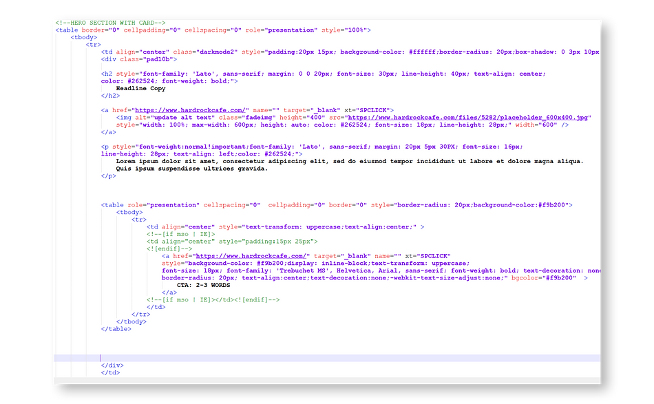
-
Custom HTML and CSS allowed for responsive images, layouts, text sizes, padding, and more.
-
CSS added that anticipated impact of Dark Mode on images, CTA's, text, etc.
-
Call to Actions updated to meet brand standards.
-
Emphasis on visually striking images over text-heavy images.
-
Module layouts created to allow users with no HTML experience to plug-and-play email content.
-
Multiple templates built to meet varying campaign needs.